
Interior Colour Palettes for Dubai Homes: Six Schemes With Hex Codes
Dubai light is strong, bright and slightly warm. It flattens cool colours and makes warm ones glow, which is why a grey that looks sophisticated in a showroom can look flat and lifeless on your wall. The six palettes below are built for that light. Each gives you five codes and a role for every one, so you are choosing a scheme rather than guessing at a single shade.
Take any of these codes to a paint supplier and they will mix it. When you are ready to put it on the wall, you can compare verified painting professionals on Taamir.
FIND AND COMPARE PAINTING COMPANIES
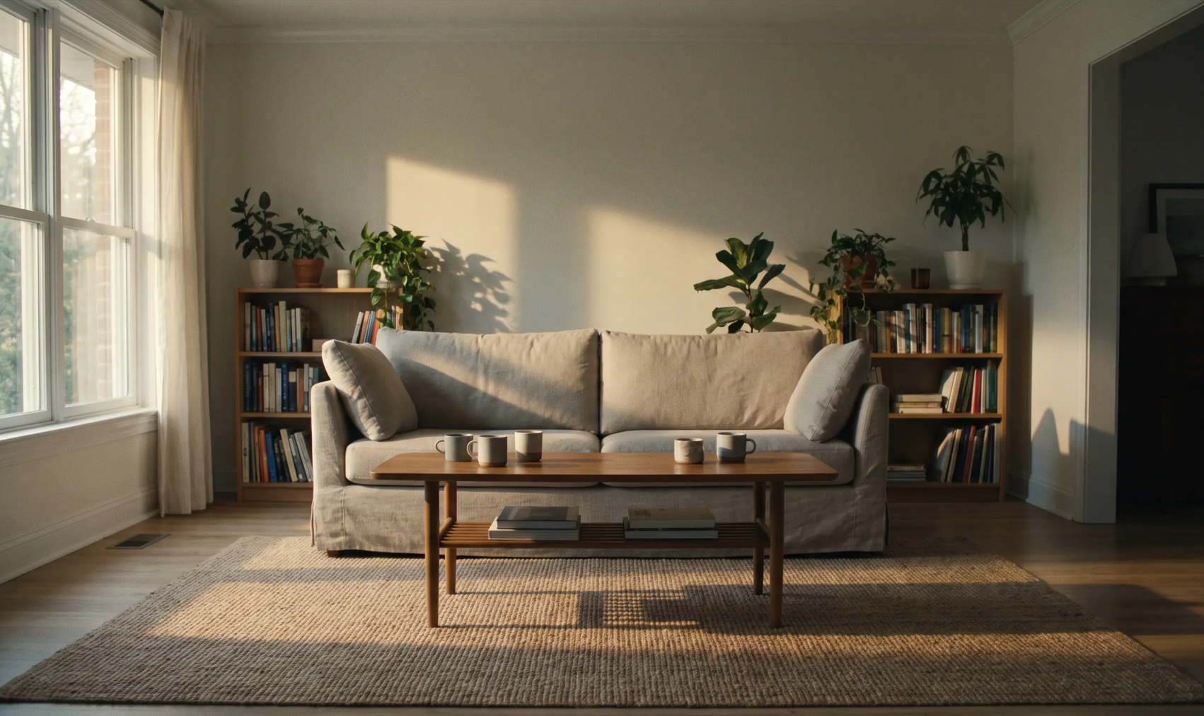
How to use a palette
Every palette has five roles. Follow them in order and the room holds together.
Main wall — the biggest area, so the least saturated colour
Secondary — a second wall, or the same colour a shade deeper
Trim and ceiling — lighter or cleaner than the wall, in a tougher finish
Accent — one wall, or joinery, or a door. Once, not everywhere
Detail — cushions, tiles, metalwork. The smallest amount and the most freedom
Rough proportions: 60% main, 30% secondary, 10% accent. Most rooms that feel wrong are carrying too much accent.
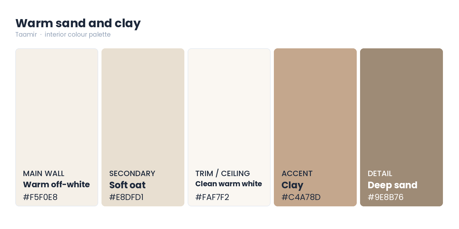
1. Warm sand and clay
The safest palette for a Dubai home, and the one that ages best. Warm enough to sit comfortably in hard daylight, and it shows dust far less than cool grey or anything very dark.
Main wall — Warm off-white, #F5F0E8
Secondary — Soft oat, #E8DFD1
Trim and ceiling — Clean warm white, #FAF7F2
Accent — Clay, #C4A78D
Detail — Deep sand, #9E8B76
Best in living rooms, bedrooms and hallways, and the sensible choice for anything you plan to rent or sell.
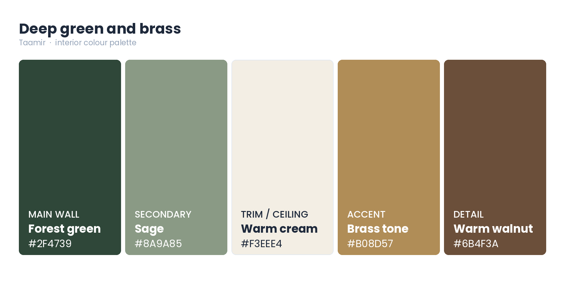
2. Deep green and brass
For a room you want to feel considered rather than bright. Deep green reads rich rather than heavy under lamplight, and it sits naturally with timber and brass.
Main wall — Forest green, #2F4739
Secondary — Sage, #8A9A85
Trim and ceiling — Warm cream, #F3EEE4
Accent — Brass tone, #B08D57
Detail — Warm walnut, #6B4F3A
Best in a study, a dining room, or a single feature wall. Keep it to rooms you use in the evening, because deep colours need warm light to come alive.
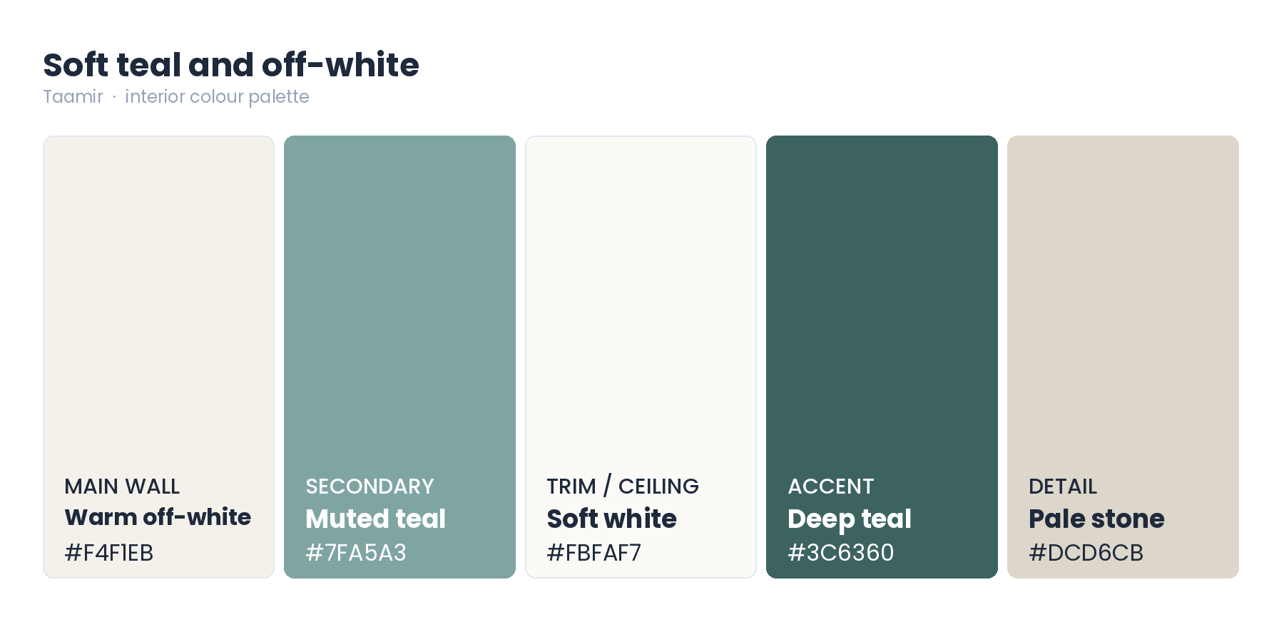
3. Soft teal and off-white
Fresh without being cold. Muted teal is one of the few cooler colours that survives strong daylight, because it carries enough green to stay warm instead of turning grey.
Main wall — Warm off-white, #F4F1EB
Secondary — Muted teal, #7FA5A3
Trim and ceiling — Soft white, #FBFAF7
Accent — Deep teal, #3C6360
Detail — Pale stone, #DCD6CB
Best in bathrooms, kitchens, dressing areas and children's rooms.
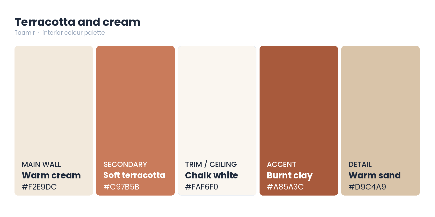
4. Terracotta and cream
The palette that most obviously belongs to this region. It reflects the warmth of the light rather than fighting it, and it sits naturally with stone, rattan and timber.
Main wall — Warm cream, #F2E9DC
Secondary — Soft terracotta, #C97B5B
Trim and ceiling — Chalk white, #FAF6F0
Accent — Burnt clay, #A85A3C
Detail — Warm sand, #D9C4A9
Best in dining rooms, hallways and any room that opens to the outside. Nothing in it depends on a trend, so it dates slowly.
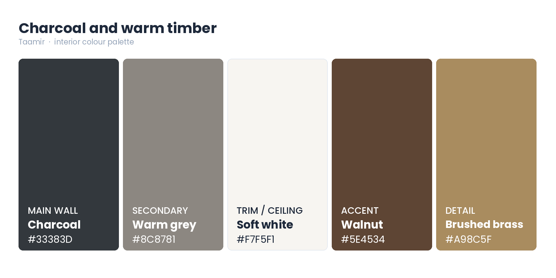
5. Charcoal and warm timber
For a room with some drama. Charcoal beats black because it keeps a little softness, and warm timber stops it feeling cold.
Main wall — Charcoal, #33383D
Secondary — Warm grey, #8C8781
Trim and ceiling — Soft white, #F7F5F1
Accent — Walnut, #5E4534
Detail — Brushed brass, #A98C5F
Best in a study, a media room, or on joinery rather than whole walls. Dark walls absorb light, so use this where you control the lighting. It also looks considerably better behind you on video calls than a pale wall.
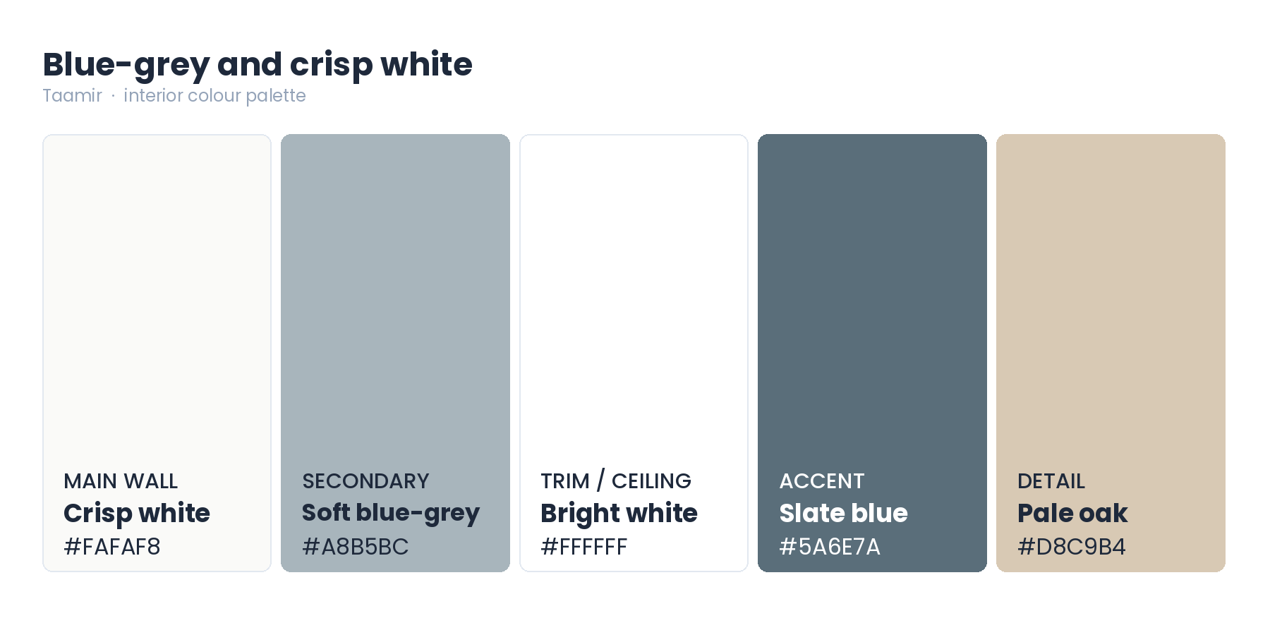
6. Blue-grey and crisp white
The cleanest and most contemporary of the six. The blue-grey here is deliberately soft and slightly warm, because a true cool grey goes flat in this light.
Main wall — Crisp white, #FAFAF8
Secondary — Soft blue-grey, #A8B5BC
Trim and ceiling — Bright white, #FFFFFF
Accent — Slate blue, #5A6E7A
Detail — Pale oak, #D8C9B4
Best in kitchens, utility spaces and minimal apartments.
Test it on the wall, not on a card
This is the step that decides whether a colour works, and the one most people skip.
Strong daylight lightens and flattens colour, so a shade reads paler on a wall than it does on a chip. Warm evening light does the opposite and deepens it. The same wall genuinely looks like two different colours across a day.
So paint a test patch at least A3 size on the actual wall, and look at it three times: morning, midday, and under your own lights at night. Choose the colour you like in all three, not the one you loved at one. Aspect matters too — a wall facing direct sun reads lighter and warmer than the same paint on a shaded wall in the same room.

Finish changes the colour
The same code in a different finish is a different colour to your eye. Matt absorbs light and gives the deepest, truest version of a shade. Eggshell and satin reflect more, so the colour reads lighter. Gloss changes it most.
Approve your sample in the finish you are actually buying, not just the colour. And remember the finish decides durability too, so a busy hallway wants satin even if matt looks better on the sample. A good painting professional will tell you which finish each room wants before you order.
Match the palette to what you already have
Most rooms already have a floor or a kitchen that is not changing, so match the wall to that undertone rather than to a photograph. Warm timber wants the warm palettes; grey tile can take the cooler ones. If your carpentry and cabinetry is oak or walnut, the blue-grey will fight it.
Keep the trim colour consistent through the whole home even when wall colours change. It is the thread that stops a house feeling like a set of unrelated rooms. If you want the full scheme settled before anyone quotes, an interior designer is the right first call.
Ask for a low-emission paint
Paint releases compounds as it dries, which is the smell of a freshly painted room. Lower-emission products mean less of it and a room you can use sooner.
In the UAE this is regulated: paints and varnishes cannot enter the market unless they carry a data sheet on the packaging showing the product's environmental performance, imported or locally made, with a green label and star rating covering volatile organic compounds and heavy metals. So take your codes to the supplier and ask for a low-emission product, particularly for bedrooms and children's rooms.
Frequently Asked Questions
What wall colours work best in Dubai?
Warm neutrals — sand, oat, warm off-white, clay and cream. Strong daylight flattens cool colours and enriches warm ones, so warm shades keep their character through the day and show dust less than cool greys.
Why does paint look different on my wall than on the card?
Scale and light. A colour across a whole wall reads paler than a small chip, and it shifts between hard midday sun and warm evening light. Paint a large test patch on the actual wall and look at it three times a day.
Can I use dark colours in a Dubai apartment?
Yes, in rooms where you control the light. Deep green and charcoal look rich under lamplight, so they suit studies, media rooms and joinery. They work less well in rooms that depend on daylight, because dark walls absorb it.
Should the ceiling match the walls?
Usually a shade lighter, or a clean warm white, in matt. Matching a dark wall exactly makes a room feel lower; a lighter ceiling lifts it.
Pick a palette, test it, then get it done
These schemes remove the hard part, which is the combination. Test your shade on the actual wall, look at it across a full day, then hand it to someone who will prepare the surface properly — that is what decides how it looks in two years. Find and compare verified painting professionals on Taamir, check their quality signals, and contact them directly